Saturday, March 31, 2012

Pixar Animation Process


Pixar Animation Studios is the best of the best and have mastered the animation process by doing it in an unusual and creative way that has led the company to success.  Even though Pixar is at a way more advanced level with their animations than I am at right now, there are still several practices that I can apply to myself at a college level.  For example, the constant critiques process is a very important practice that not only Pixar is able to do at the advanced level they are at, but that I can also do with my Professors, fellow classmates, or other peers.  The purpose of critique is to offer comments on the work in progress and how the work could be changed in any ways for the better, which can lead to some major revisions and then to success.  Another example is the practice of creating storyboard sketches for each scene of the animation with the inspiration that I have come up with so far.  The storyboards allow me to begin to imagine the look and feel of each scene like it does for the filmmakers of Pixar.
         Character design is also a practice that is doable for me at a college level.  At Pixar studios they have thought out their characters and the way they are going to look by creating digital illustrations either by drawing them out by hand or some which are sculpted in clay and scanned, and later visual textures such as fur, fabric, or hair will be added to the form, which is a step known as simulation.  At the college level and with the skills and resources that I have, I would most likely only be able to practice character design by drawing out my characters by hand instead of using the other techniques that Pixar has mastered.
The steps of the animation process that seems most difficult are the technical challenges that start to pile up such as working with each character that can be defined by up to 1,000 avars, which are points of possible movement, that the animators need to work with, and the rendering of the film is very tedious as the average frame takes about seven hours to render and a movie has 24 frames per second.
The step of the animation process that seems most important is the presentation of the story reel with pre-recorded lines by the Pixar employees that is projected to an in-house audience.  This seems like it is the most important step because it allows the filmmakers to see what works and what doesn’t depending on not only the character design and layout of the film up on the big screen but the audience’s reaction to it as well.  This process will then allow the filmmakers to change whatever they need to in order to make the film a greater success.
In my opinion, the most interesting step in this entire process would have to be the animation process because of the complex steps they have to take that make the film so realistic and amazing.  Regardless of the incredibly long and tedious hours that have to be put into this process, I think it is the most interesting because of the results that are developed during this process, such as the exact movements that the animators must put into the characters to make them seem so realistic or the work that they put into “Lotso” in Toy Story 3, for example, to make his fur look so textured and realistic.
This entire process is especially reflected in the final Toy Story 3 animation.  The film would not look nearly as realistic and incredible as it does if Pixar had not gone through this long and tedious process.  The lights, shadows, textures, and shades that are just a small portion of what makes up this film are so precise and realistic that it has led this film to become a great success.  Another Pixar animation that I enjoy very much is the animated short “Jack-Jack Attack” from The Incredibles, which Pixar must have gone through a very similar animation process to make as the one that they utilize when producing their other big films, such as Toy Story 3.  For example, in “Jack-Jack Attack” the lights, shadows, textures, and shades that appear on the characters faces or objects within the scenes seem to be equally as realistic as they do in Toy Story 3, and the scene where Jack-Jack lights up into flames and takes the shape of a fire ball baby is my favorite because the flames seem so realistic and the lights and shadows they used to make the reflection of the fire on other objects seems so precise and accurate as to what it would appear as in real life as well.

Saturday, March 24, 2012

Animated Poems

One example of an animated poem that I think is effective is the "Dark Knight Kinetic Typography" animation.  "The Dark Knight" animation is a type of kinetic typography, which I think is effective and works because there are so many different uses of typography incorporated into this animation which really go along well with the specific words that are being spelled out.  The animation does a good job when considering it's type choices, colors, effective movements, timing, pacing, transitions, mood, as well as using limited additional graphics, which really add to the story.  Examples of the different uses of typography in this animation where it does a good job using effective movements and timing is when it spells out the line "I'm only burning my half"and has the right half of the words disintegrate to make it looks like the words are burning away.  The timing was well thought out as well as it began to disintegrate as the words were "burning my half" were said.

Another line where this animation used good type choices, and also changed the font size and colors, and also used limited additional graphics was:
The pacing throughout this kinetic typography animation was perfect along with the timing of the words being laid out across the screen.  It was very easy for the viewer to read the words and they did not fly across the screen too fast.  Most of the transitions in this animation were made with cool effects such as the foggy background that would disintegrate and new words would appear on the screen, or in many cases the phrase would altogether move to one side of the screen and the next sentence would then appear again in the middle of the screen where the previous sentence just was.

Another example of an effective animated poem is the "Fight Club - Chemical Burn - Kinetic Typography" animation.  This animation has some aspects that I find make it less effective, such as the sound and words being spoken too quietly and mumbled as well as the timing and pacing of the words moving too fast across the screen.  Overall, the animation did a good job with it's type choices, colors, effective movements, transitions, mood, as well as using limited additional graphics, which added to the story.  An example of part of the animation which included limited additional graphics was for the line "May I see your hand please?" and then the man kissed his hand.  Here is a screen shot from this part in the animation that used additional graphics.
An example of a scene from the animation where it used effective movements and type choices, as well as additional graphics was:

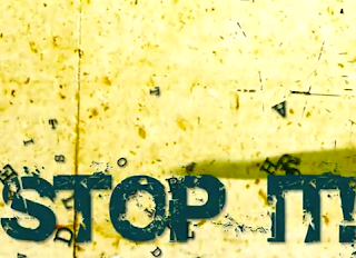
Another example of a scene from the animation that used effective movements and type choices was: 
In this scene the line "Stop it!" suddenly stamped down onto the bottom half of the screen and the letters from the previous line went flying.
I learned a lot from these viewings of different types of kinetic typography animations that I could apply to my own work, such as considering the different type and font choices that are available and which ones would go best with which line and words.  I also learned to take into consideration the different colors and effective movements that could match and really emphasize the word(s) that I am trying to portray to the viewer.  The timing and pacing are also very important to the animation because if the words fly across the screen too fast or are too hard to read then it will be less effective to the viewer.  Finally, transitions are also a very key part to making the animation successful.  The transition needs to be clean and smooth, where it does not effect the ability to read the words or the effective movements in the animation.

Thursday, March 8, 2012

Popular Flash Animations

The animation that I enjoyed watching the most was "Dancing Animals in Love."  The story was about all of these creatures dancing, laughing, and happily singing about falling in love.  I enjoyed watching the animation because the story was cute and the song that went along with it was also very catchy.  The characters were very childish and unrealistic looking because they did not look like real characters that would exist in our reality.  They were made up of all different colors, shapes, and sizes.  The style of graphics looked like a cartoon type of graphic that could be seen in scenes from a children's book or movie.  I say this because not only were there childish-looking characters throughout the animation, but there were also a lot of flowers, grassy plains and trees, butterflies, rainbows, bright and happy colors, and all of the animals had a big smile across their faces the entire time.  However, there were a few scenes that were a bit inappropriate for a children's theme, such as when the animals were licking and mating, and especially what surprised me the most was at the very end of the video when suddenly several enormous buildings shoot out of the ground killing all of the animals....  It was definitely unexpected and contradicted the children's book theme that they had going on throughout the entire rest of the video, which made the animation very ironic.  The characters were also very simple animations, though, as there were very few and limited movements.  For example, during the part where all of the animals were clapping, there was a still image of the animal's face while only it's body (the arms) of the animal moved together in a clapping movement to make a simple animation of the animals clapping.  The transitions in this animation would for the most part just immediately flash to another scene in the video, either in the same location or to a scene with a completely different background.  Sometimes the transition would show the previous scene but either zoomed in or zoomed out, and several times it would pan horizontally across showing the rest of the characters and scenes.  All of these factors about this animation, the characters, the story, style of graphics, and transitions, are what made the animation work and flow together, and what made it successful.
Some things that I could carry over to my animation efforts are following similar transition effects that were used in the animation "Dancing Animals in Love," as it gave me many ideas that were clear and very possible for me to do in my animations as well.  Also, the characters in this animation inspired me to try to use some in my future animations that are of similar type of graphics.  These type of characters would be those where they can be very simple and unrealistic looking characters that do not need to have a lot of movement to them in order to get the point of what action they are performing across to the viewer.

http://www.shortoftheweek.com/2009/02/19/dancing-animals-in-love/