Another line where this animation used good type choices, and also changed the font size and colors, and also used limited additional graphics was:
The pacing throughout this kinetic typography animation was perfect along with the timing of the words being laid out across the screen. It was very easy for the viewer to read the words and they did not fly across the screen too fast. Most of the transitions in this animation were made with cool effects such as the foggy background that would disintegrate and new words would appear on the screen, or in many cases the phrase would altogether move to one side of the screen and the next sentence would then appear again in the middle of the screen where the previous sentence just was.
Another example of an effective animated poem is the "Fight Club - Chemical Burn - Kinetic Typography" animation. This animation has some aspects that I find make it less effective, such as the sound and words being spoken too quietly and mumbled as well as the timing and pacing of the words moving too fast across the screen. Overall, the animation did a good job with it's type choices, colors, effective movements, transitions, mood, as well as using limited additional graphics, which added to the story. An example of part of the animation which included limited additional graphics was for the line "May I see your hand please?" and then the man kissed his hand. Here is a screen shot from this part in the animation that used additional graphics.
An example of a scene from the animation where it used effective movements and type choices, as well as additional graphics was:
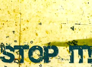
Another example of a scene from the animation that used effective movements and type choices was:
In this scene the line "Stop it!" suddenly stamped down onto the bottom half of the screen and the letters from the previous line went flying.
I learned a lot from these viewings of different types of kinetic typography animations that I could apply to my own work, such as considering the different type and font choices that are available and which ones would go best with which line and words. I also learned to take into consideration the different colors and effective movements that could match and really emphasize the word(s) that I am trying to portray to the viewer. The timing and pacing are also very important to the animation because if the words fly across the screen too fast or are too hard to read then it will be less effective to the viewer. Finally, transitions are also a very key part to making the animation successful. The transition needs to be clean and smooth, where it does not effect the ability to read the words or the effective movements in the animation.


No comments:
Post a Comment